By: Logan Griffiths
Welcome to the first addition of Data Driven Articles! This week we are diving into the QB conversation, where we find out which QB’s are contributing to their teams the most. In order to found out who has the highest impact we are looking into Defensive Power Scores, Offensive Power Scores, and QB Passing Efficiency.
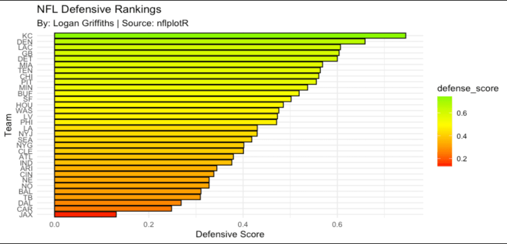
Defensive Power Score:
In evaluating NFL team defenses, it’s essential to go beyond raw statistics and consider normalized performance metrics that allow for a true comparison among teams. This code snippet that generated this graph is designed to filter, aggregate, and analyze key defensive metrics. By examining each team’s effectiveness against the pass and run, I generated to code for expected point added (EPA), and win probability added (WPA), as well as success rate and total yards allowed. However, simply looking at thes raw numbers can make it challenging to fairly rank teams with varying play counts or situational differences. That’s where normalization becomes invaluable.
To normalize, the code calculates each team’s EPA, success rate, WPA, and yards allowed on a relative scale, comparing each metric to the range of values across all teams. By transforming these metrics into scores between 0 and 1, we can aggregate them into an overall defensive score that captures the full scope of a team’s defensive performance. This normalization helps avoid misleading impressions caused by outliers or skewed data, ensuring that each team’s final defense score reflects consistent defensive prowess across multiple metrics. Finally, the defense rankings are visualized with a color gradient to highlight performance, giving readers an immediate sense of each team’s standing among their NFL peers. This approach provides a structured, quantitative basis for evaluating defenses and offers context for deeper discussions on quarterback performance relative to team strength.
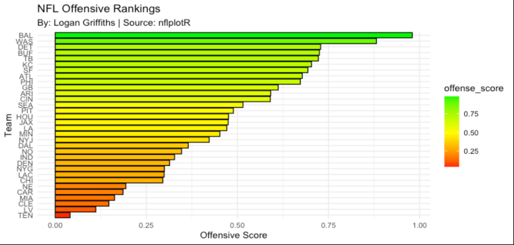
Offensive Power Score:
When looking at NFL offenses, it’s tricky to combine different stats into one reliable score that shows how well each team performs. This analysis takes key offensive numbers and creates an overall ranking of NFL offenses. By looking at running and passing plays, we group the data by team and calculate averages for important stats like expected points added (EPA), win probability added (WPA), success rate, and total yards gained. Together, these numbers show how well a team scores, how often their plays work, and how much they affect the game’s outcome. To make sure we have enough data, each team needs at least 100 plays to be included.
To compare teams fairly, I adjusted each stat to use the same scale. This means converting each team’s EPA, success rate, WPA, and yards gained to a scale from 0 to 1, based on how all NFL teams perform. This lets us calculate an overall “offensive score” by averaging these adjusted numbers. This final score gives us a clear picture of how good each team’s offense is, showing both their ability to score and how consistently they make successful plays.
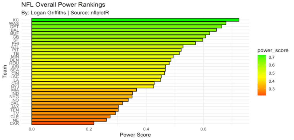
Total Team Power Score
The Total Team Power Score combines each team’s Offensive and Defensive Power Scores to provide a comprehensive measure of overall team strength. By averaging the two scores, we gain a balanced view of how well-rounded each team is across both sides of the game. A team with high scores in both offense and defense will naturally rise to the top, as they demonstrate both scoring ability and defensive reliability. Conversely, teams with a significant imbalance—strong on offense but weak on defense, or vice versa—will see their power score tempered, highlighting areas that might need improvement.
This combined metric not only simplifies the analysis by consolidating key aspects of performance into one score but also makes it easier to compare teams holistically. In the graph, teams are ranked by their power scores, displayed with a color gradient from red to green. The gradient visually emphasizes which teams are balanced powerhouses, which are more one-dimensional, and which may struggle in multiple areas. This Total Team Power Score provides a straightforward and informative way to evaluate each NFL team, setting the stage for a more nuanced conversation about which quarterbacks are positioned to make the most impact based on the overall strength of their teams.
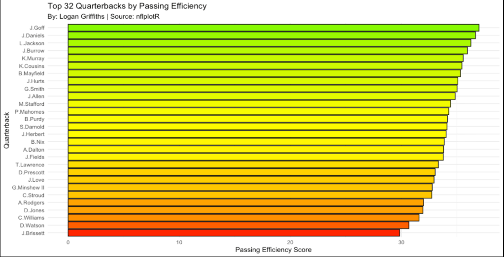
QB Passing Efficiency
The Top 32 Quarterbacks by Passing Efficiency graph provides a comprehensive look at quarterback performance, focusing on key metrics such as air yards, completion percentage, and interception rate. This analysis filters for quarterbacks with a minimum of 150 pass attempts to ensure that the data reflects a substantial body of work. Each quarterback’s passing efficiency score is calculated by weighing average air yards and completion percentage positively, while deducting points for interceptions, thus emphasizing both scoring potential and risk management.
In the resulting bar graph, quarterbacks are ranked by their passing efficiency scores, which are visually represented using a color gradient ranging from red to green. The gradient offers an immediate visual cue: red indicates lower efficiency, yellow suggests average performance, and green highlights top-performing quarterbacks. This intuitive representation makes it easy for fans and analysts to identify standout players as well as those who may struggle in their passing game. By presenting these efficiency scores in a clear and engaging format, the graph facilitates deeper discussions on quarterback performance and their impact on team success in the NFL.
QB Passing Efficiency in Correlation to Team Performance
In this analysis, we explore the relationship between quarterback passing efficiency and team performance using the Team Power Scores we established earlier. By calculating passing efficiency scores for each QB, factoring in air yards, completion percentage, interception rate, and more, we can see how well quarterbacks contribute to their teams. The scatter plot visualizes this relationship, showing QBs plotted against their respective team power scores. A custom diagonal line indicates performance thresholds, distinguishing those who outperform expectations from those who fall short. This analysis helps identify “carried QBs”—those with low efficiency on strong teams—offering insights into their potential and highlighting the dynamics between individual quarterback play and overall team strength. By visually presenting this data, we aim to foster discussions on which quarterbacks may need to elevate their game to match their team’s capabilities.
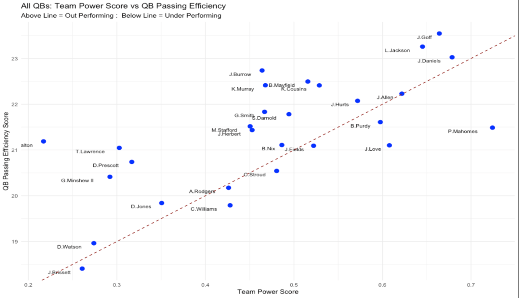
The sloped line is the axis in which we measure if one is playing to their teams standards. The Quarterbacks under the line are underperforming and those above are outperforming.
Notable Outperforming:
Bo Nix, Trevor Lawrence, Dak Prescott, and Daniel Jones.
Notable Underperforming:
Patrick Mahomes, Jordan Love, Brock Purdy, and CJ Stroud.
Thank you for reading my first “Data Driven Article”, I look forward to many more!

Leave a comment